On May 13, 2018, more than seven thousands of runners ran the Copenhagen Marathon. When I ran it in 2015, I was very impressed in pacemakers), the guys who were running with specific paces and other runners who wanted to be at the finish in a specific time, just followed them:
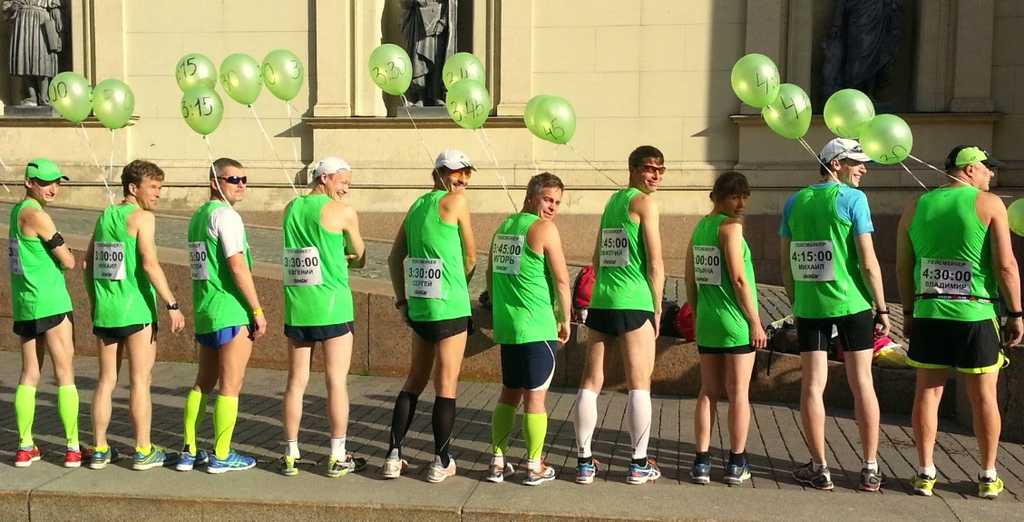
(image source: http://balti.run/en/become-a-pacemaker-for-balti-half-marathon/)
I was wondered what will be on a chart if I will plot all the marathon runners paces over the distance. Here it is:
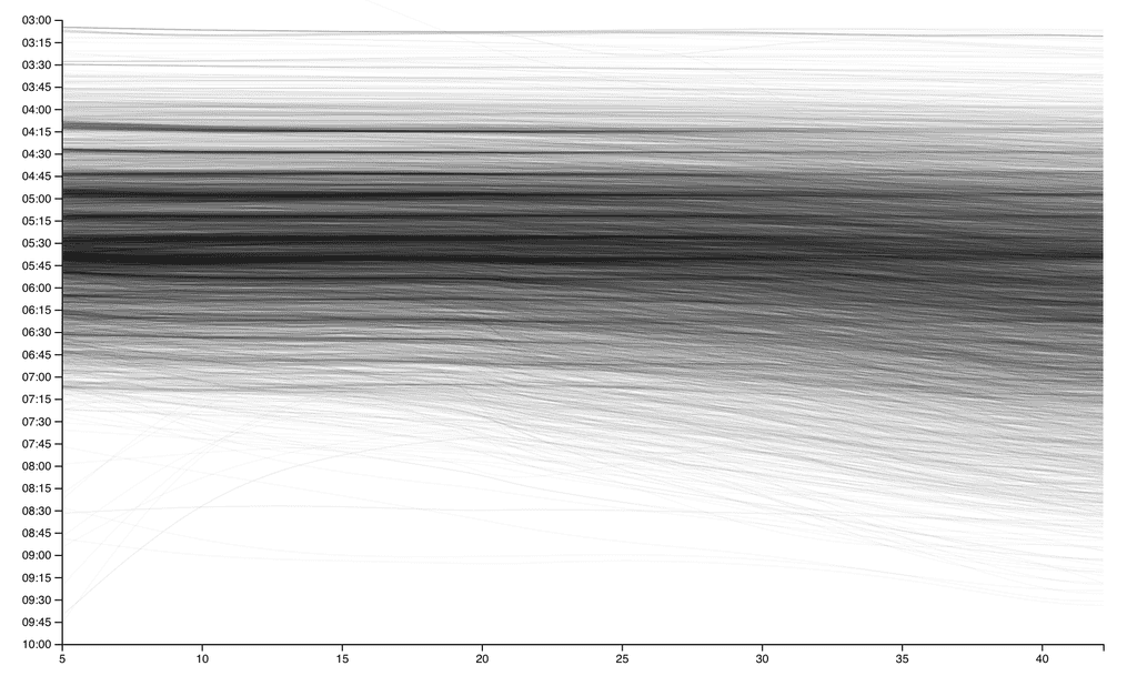
We can visually see how many runners follow their pacemakers or aiming to complete the race in a ‘round’ time.
Many of the pacemakers (men) were dressed in skirts and wigs with pigtails like these:

(source: https://www.instagram.com/p/BjAnLtXHeZi/)
On their backs, they have inscriptions like: “if you see this, you are running like a girl”. I wanted to check that idea, so all men are blue and women are pink on the next chart:
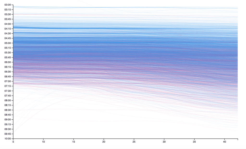
Indeed, women tend to run slower, despite there are very fast women and very slow men. Fairly speaking, I was also pretty slow and finished the Marathon in 4:30, 6:25 min/km, which is a bit slower than Oprah’s time. To get more understanding about how big is the difference, I plot a chart where the x-axis is the average pace and the y-axis is the number of men (blue) an women (pink) finished with that average pace. Because there are less women than men who ran the marathon, the amounts of women is multiplied proportionaly:
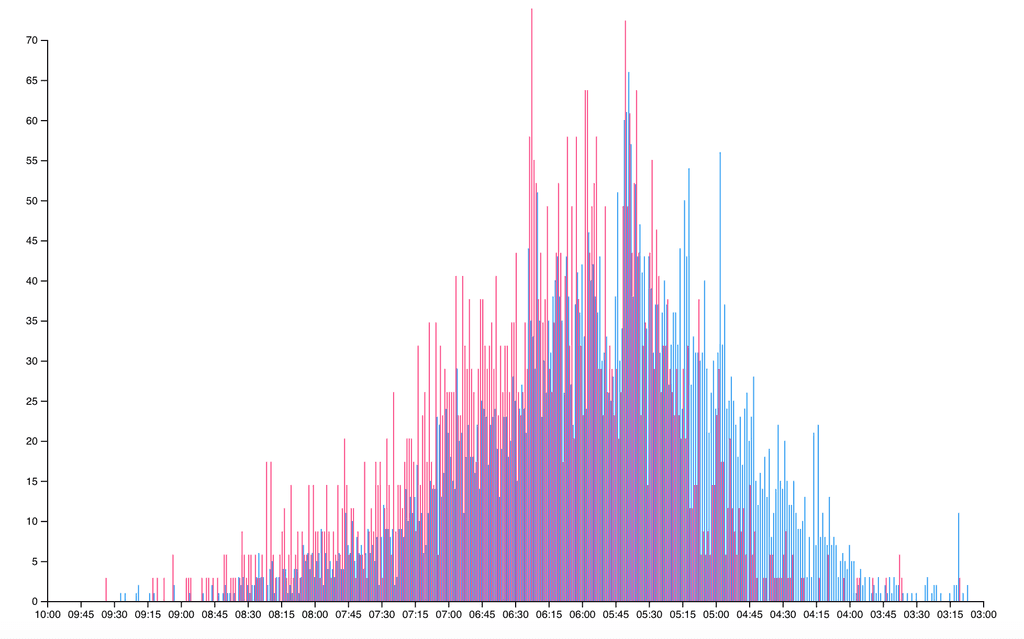
Here we can visually see that despite more men finish with faster paces and more women finish with slower paces, men and women have more in common than differences and most people finish with the same pace regardless of sex.