Here is a quick and dirty implementation of the k-means clustering used to find a palette of dominant colours for an image.
The code is hosted on the Observable notebook.
Let’s take a picture
For example, let’s take this nice colourful photo taken by Jacek Dylag on Unsplash:

To save the performance (remember, we run this code in the browser), let’s take a sample of 1000 random pixels of the image:

It’s nearly impossible to guess the original image from these dots, but because they are randomly taken, we can use them as a sample data.
The photo’s size is 600*399, which gives us 239400 pixels. Each pixel has 3 dimensions: red, green and blue (RGB) and can be represented as a vector:
pixel = [R,G,B]
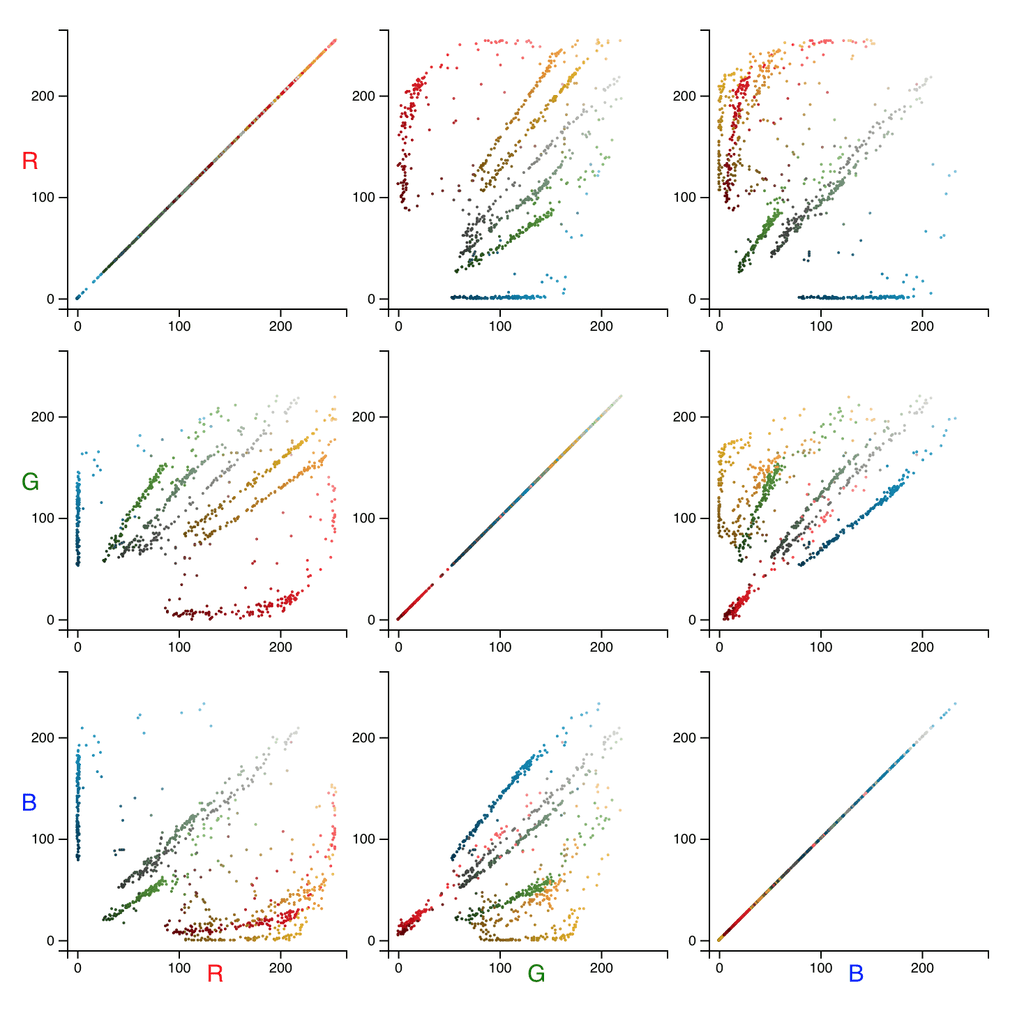
Let’s visualise the sample dots by drawing 2D projections of the 3D RGB color space:

K is for cluster
k-means clustering is a method of vector quantisation, originally from signal processing, that is popular for cluster analysis in data mining. k-means clustering aims to partition n observations into k clusters in which each observation belongs to the cluster with the nearest mean, serving as a prototype of the cluster. Wikipedia
The classical k-means algorithm consists of the following steps:
- Take random k points (called centroids) from a space formed by our data points (i.e. vectors).
- Assign every data point to the closest centroid. Each centroid with assigned data point we call a cluster.
- For each cluster, find a new centroid by calculating a center between all the data points in the cluster.
- Repeat steps 2. and 3. while the coordinates of centroids change.
Simple as a pie, isn’t it? Well, yes, but there are some nuances.
Performance
Say, k is a number of clusters (as well as centroids) and n is a number of data points, d is a number of dimensions (vector length) and i is a number of iterations (how many times 2. and 3. have to run). Roughly speaking, the complexity of this will be:
O(k * n * d * i)
This can be pretty slow, and here are some simple ways to speed it up:
- Find the final centroids on the sample data and then run the last iteration on the full set. Usually, this significantly reduces the number of iterations on the full set.
- Set the top limit for the iterations number, so the method will not freeze forever.
- Set the minimal distance when centroids are considered to be the same. On my code, this saved 3–5 iterations when the distance is less than one but still slightly greater than zero.
- If you use Euclidean distance, don’t calculate the root, the squared distance is ok.
Distance and scale
- Squared Euclidean distance is the simplest one, however, it may not be good to calculate the color difference.
- RGB color space is very simple, but again, if you really need to calculate the color difference precisely, use Lab and CIEDE2000.
The optimal number of k
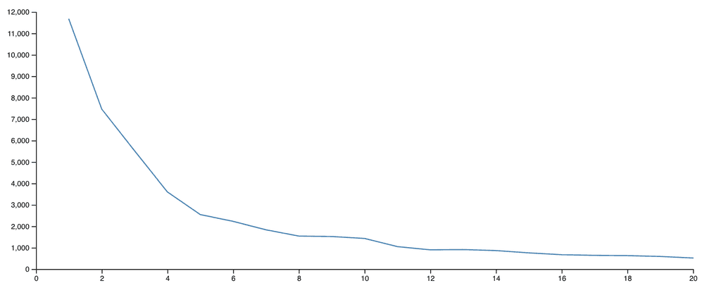
To find an optimal k, I find the average variance for each cluster on the sample data. Simply put, a cluster’s variance is an average distance between its centroid and each point of the cluster. Therefore, the average variance of for a given k is the average variance of all its clusters. If we draw a chart where the variance is on the y-axis and k is the x-axis, we will see that the variance drops down, but at some point, the slope is decreasing significantly and after this value of k we can observe even some increasing of the variance:

Now put this all together:
- Take a sample data set.
- Find centroids for different k on the sample data set.
- Find from which k the variance slows down its decrease.
- Run the k-means clustering with given initial centroids on the full data set.
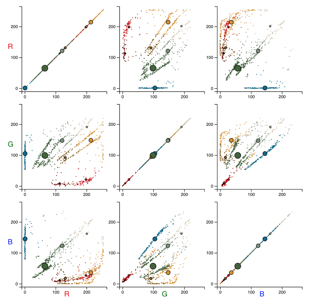
Voilà:

The big circles represent centroids. The bigger a circle, the more data points are assigned to this centroid.
And the posterised image:
